

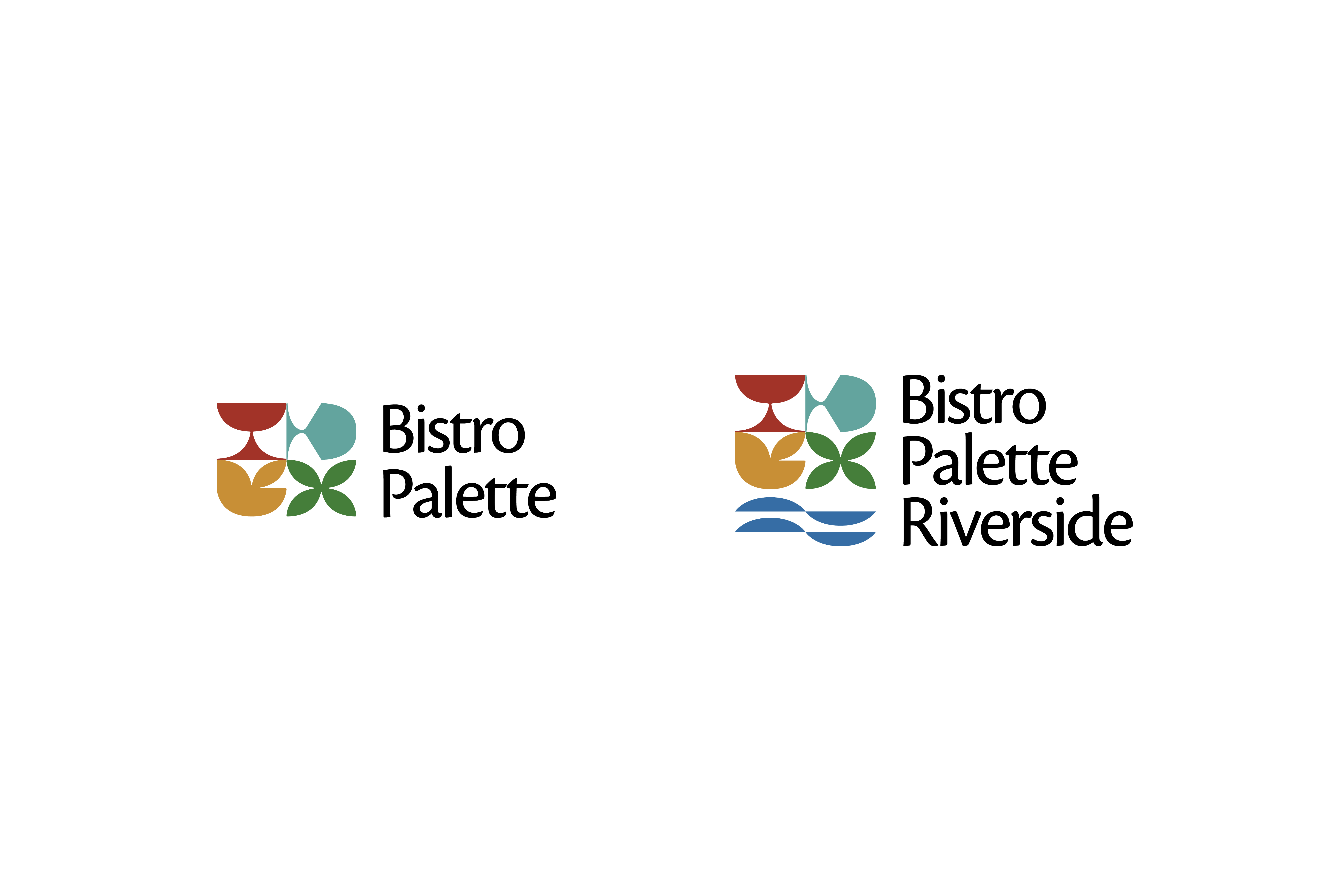
Bistro Palette

A Bangkok restaurant's whole brand — named for a palette, and composed like one.

Brand Strategy
Visual Identity
Interior Design
Photographic Direction
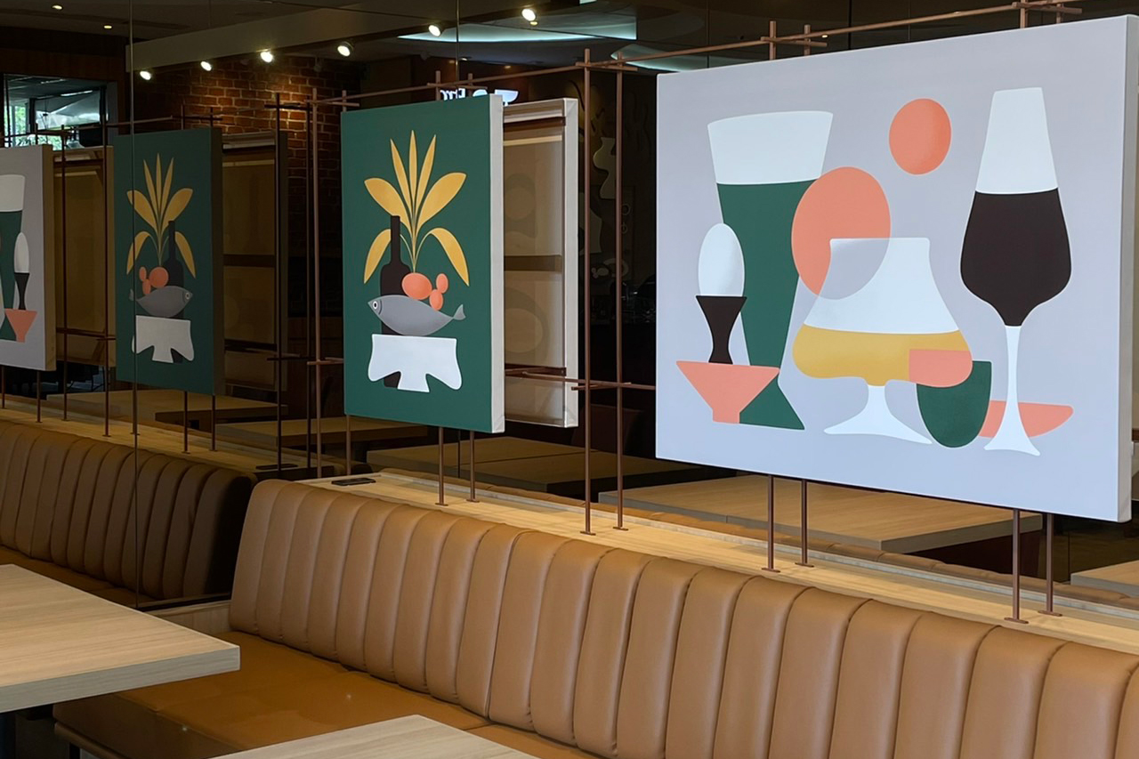
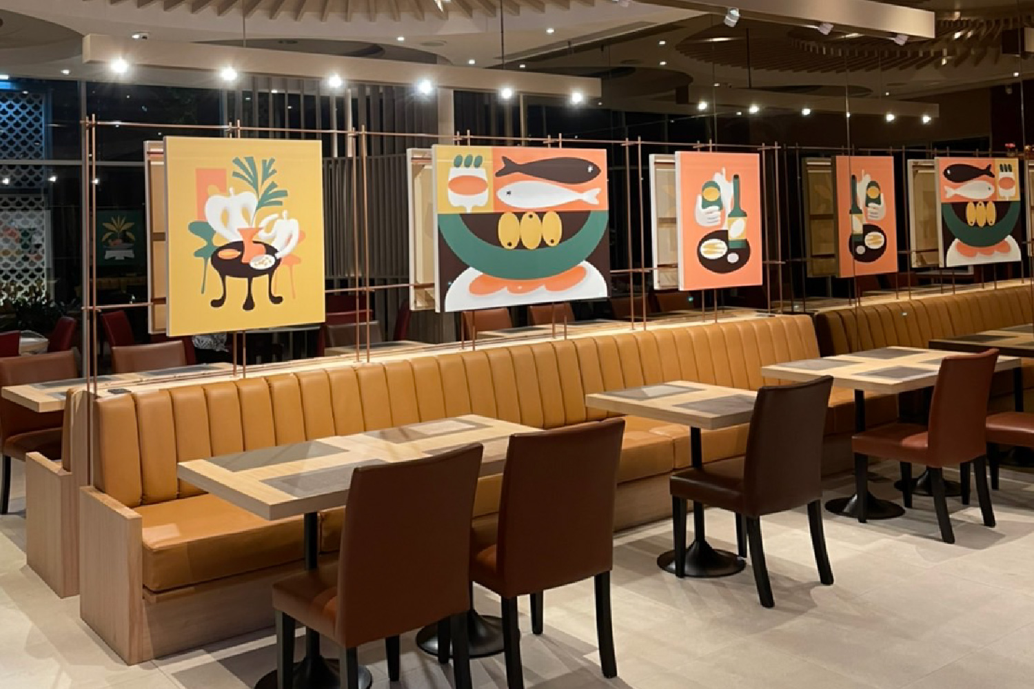
Bistro Palette dining room with tan leather banquettes and bold illustrated panels of Thai dishes
Role
Total brand direction — naming · logo & identity · menu & graphics · interior (3D → built) · art direction
Year
2023
Location
Bangkok
Bistro Palette is a Southern-Thai restaurant in Bangkok, brought into being as a single brand — from the name and identity to the menu, the graphics, the interior, and the art on its walls. The name set the idea and the method both: a palette is a range held in order, distinct colours that read as one composition. Southern Thai cooking works the same way — bright, layered, unmistakably itself — so I directed every layer to hold that range without muddying it. I ran the direction from Japan and saw it built on the ground in Bangkok; the brand is one composition, made to survive the distance.
No items found.
Context

A restaurant brand in a competitive Bangkok mall needs every layer to agree — name, identity, menu, interior, and art. Sourced from separate vendors, in separate countries, those layers drift, and the result feels assembled rather than composed. And here the direction had to hold across a border, from Japan, without losing the warmth and specificity that make a Southern-Thai table feel like itself.
‍

No items found.
Approach

The real problem wasn't designing a restaurant brand — it was holding one intention across a border, where name, interior, and art usually fracture between vendors and countries. I decided to be the single point of judgment for the whole chain, run from Japan: not to manage Thai execution, but to author the brand and see it built. The bridge isn't a service line; it's the method.
No items found.
Outcome

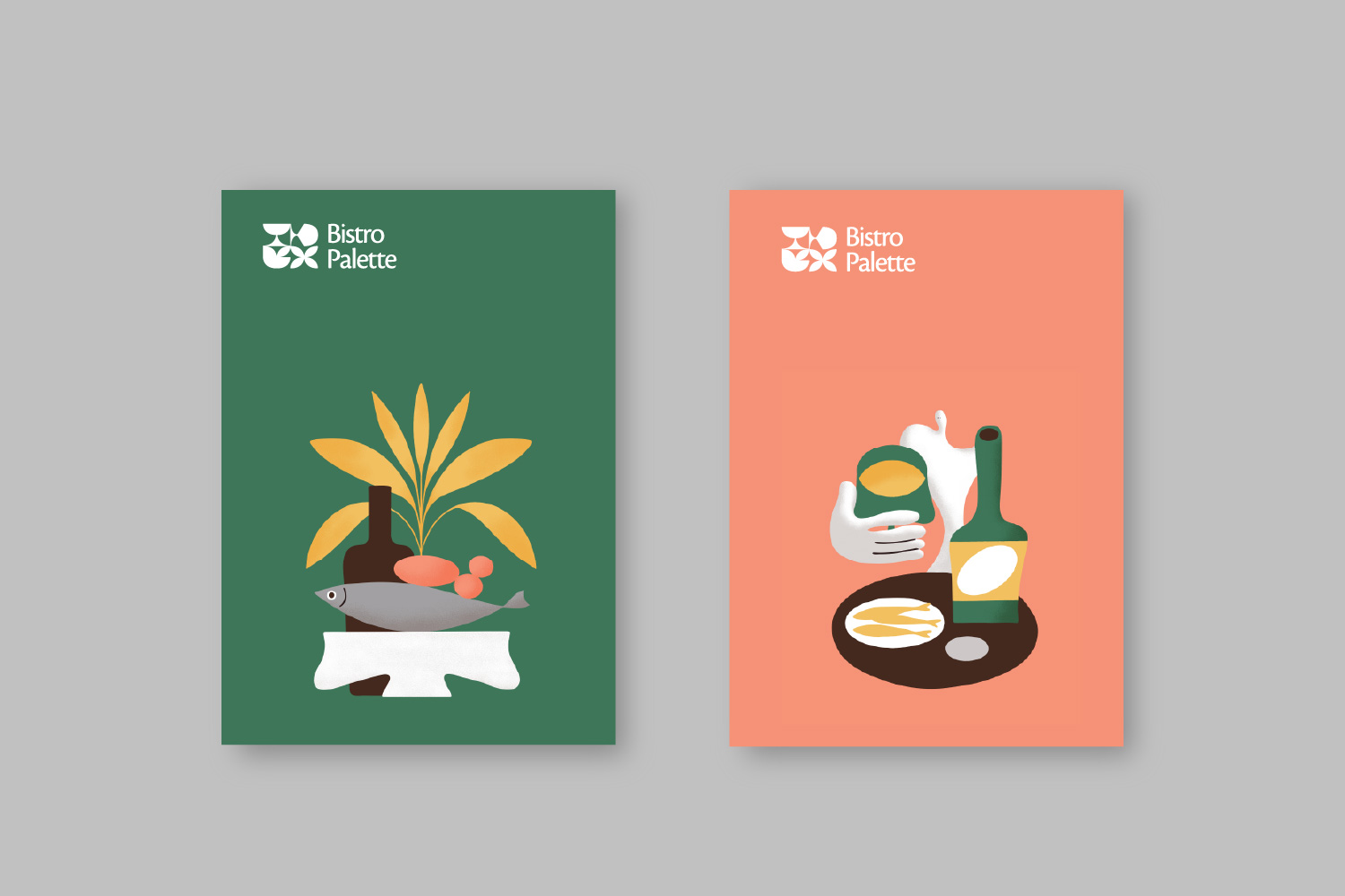
The naming and identity set the composition; the menu and printed collateral carried its colour; the interior — circular ceiling baffles, warm wood, banquette seating — I designed in 3D and saw through to build in Bangkok; and the wall art and signage I art-directed so the space signs itself. Each layer stays distinct yet reads as one palette — bright without turning loud, considered without turning cold. The Riverside identity extends the brand across outlets, so the composition holds not just across a room but across a growing relationship.
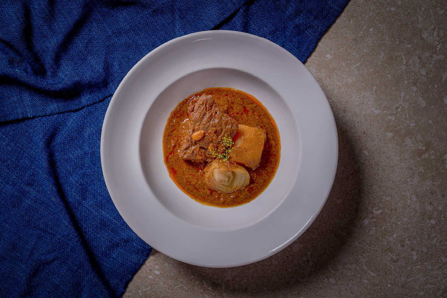
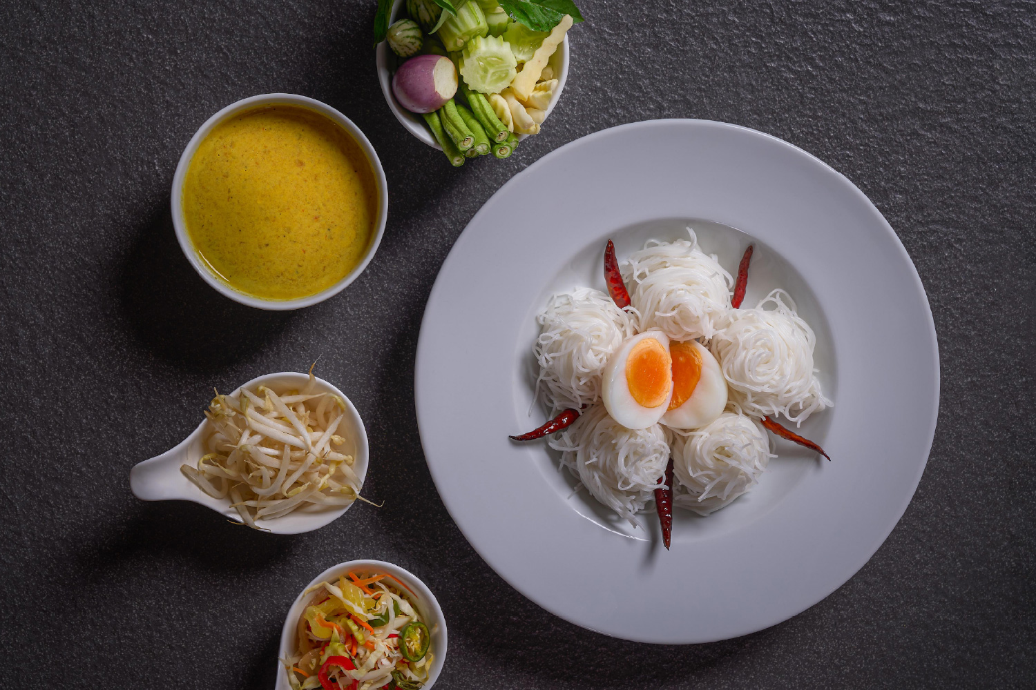
‍

No items found.
Credits
Additional work
SOJYU
Arrow pointing right icon
Brand Identity
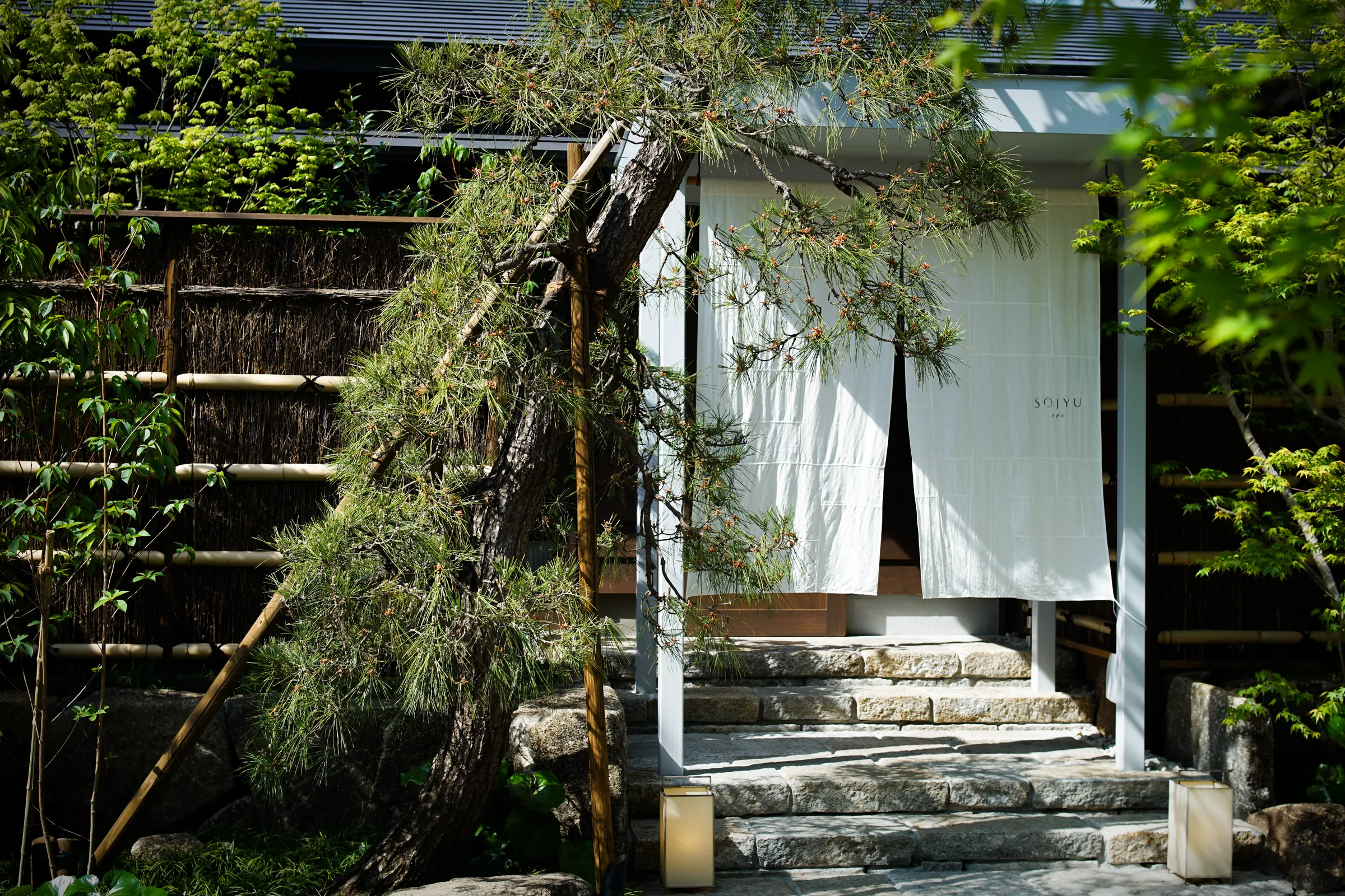
SOJYU store entrance: white noren curtains under a pergola, stone steps and garden greenery
strangers
Arrow pointing right icon
Exhibition & Object
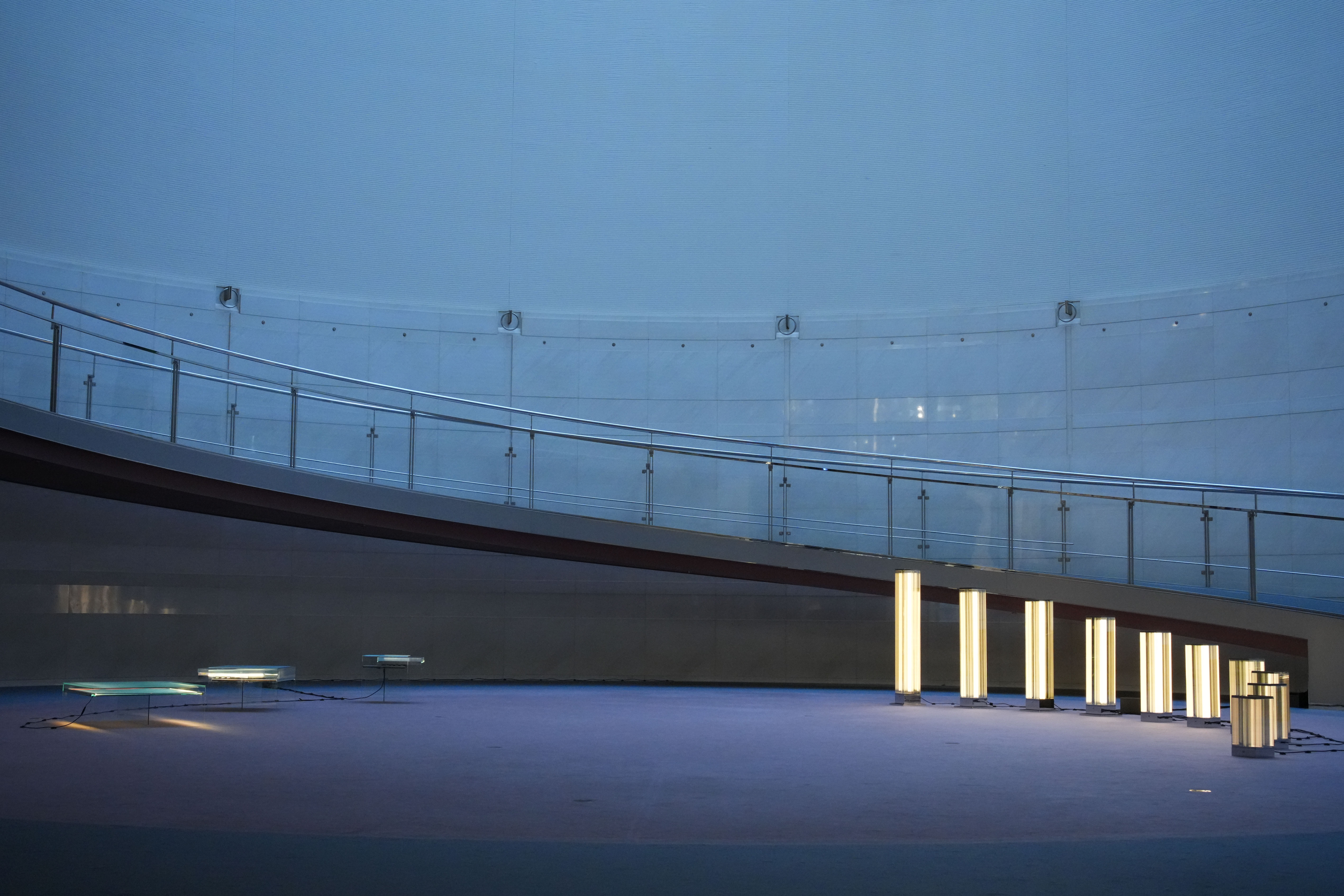
Row of glowing glass light columns on the curved terrace of Spiral, Omotesando, at dusk
TAP
Arrow pointing right icon
Brand Identity
Talent Acquisition Partners logo on a glass office partition, with people meeting behind it
Tours
Arrow pointing right icon
Digital & Systems
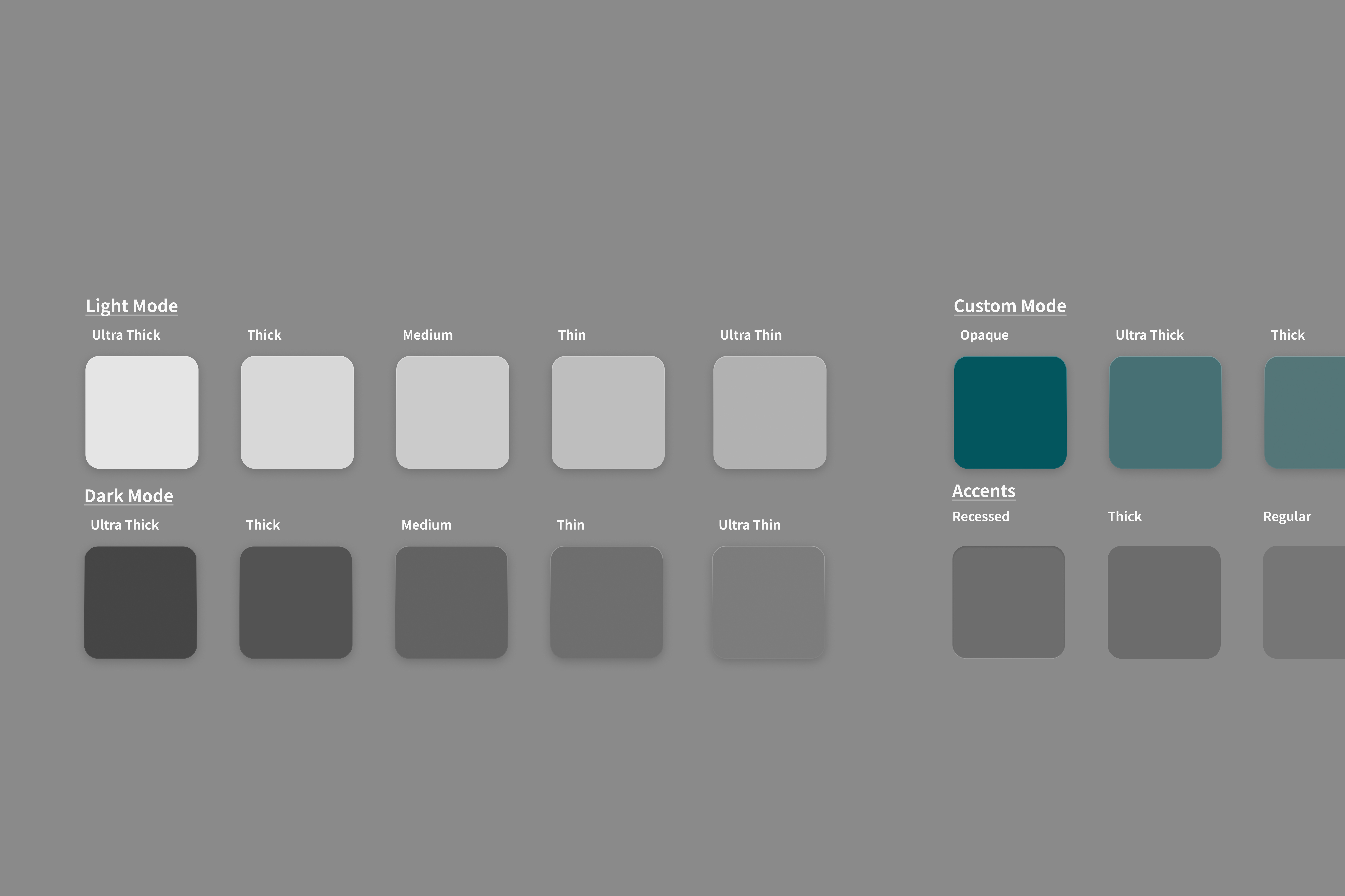
Tours design-system surface tokens: light, dark, custom teal and accent swatches
A live real-estate SaaS
Arrow pointing right icon
Digital & Systems
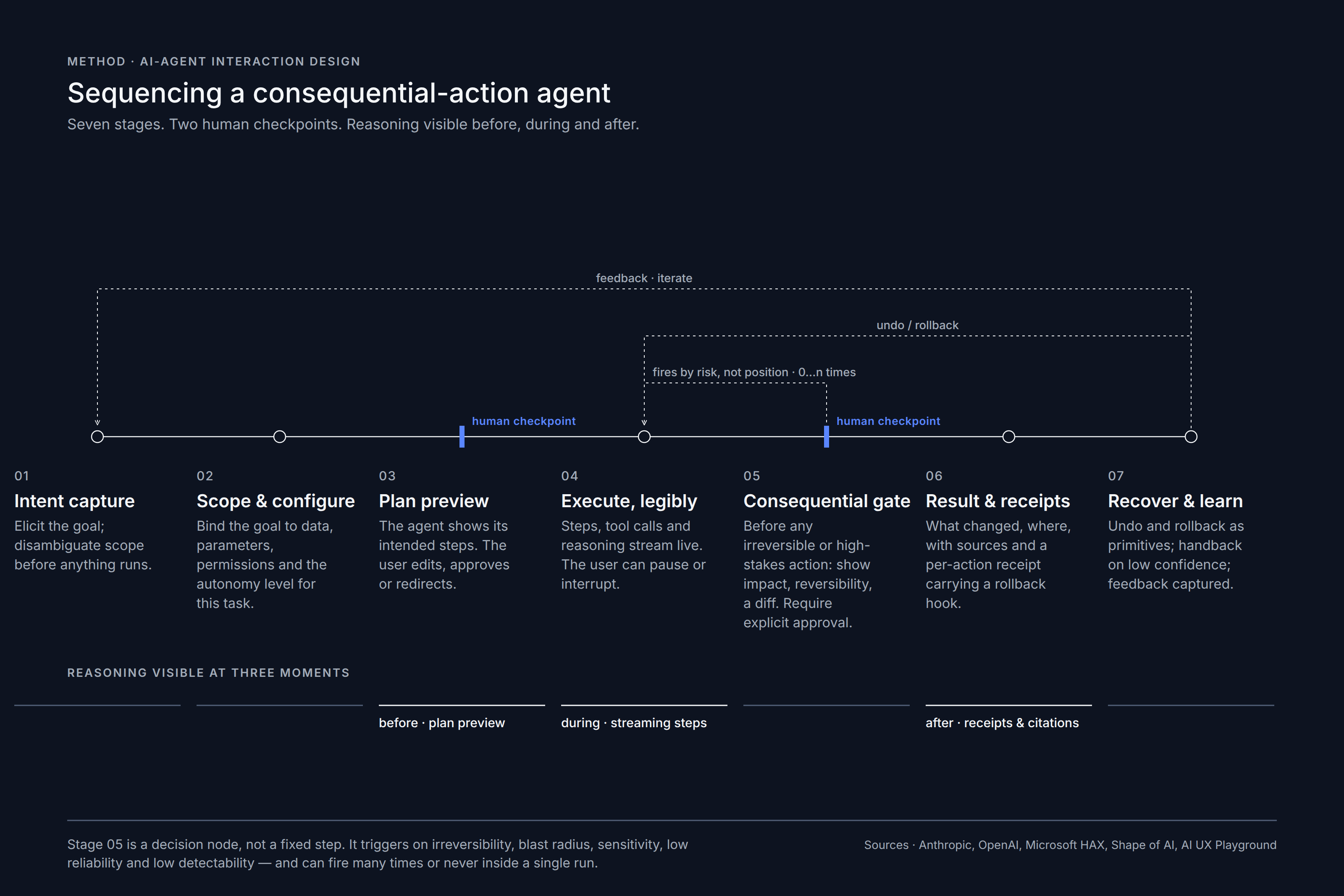
Diagram: sequencing a consequential-action AI agent in seven stages with two human checkpoints
Bricole
Arrow pointing right icon
Spatial & Hospitality
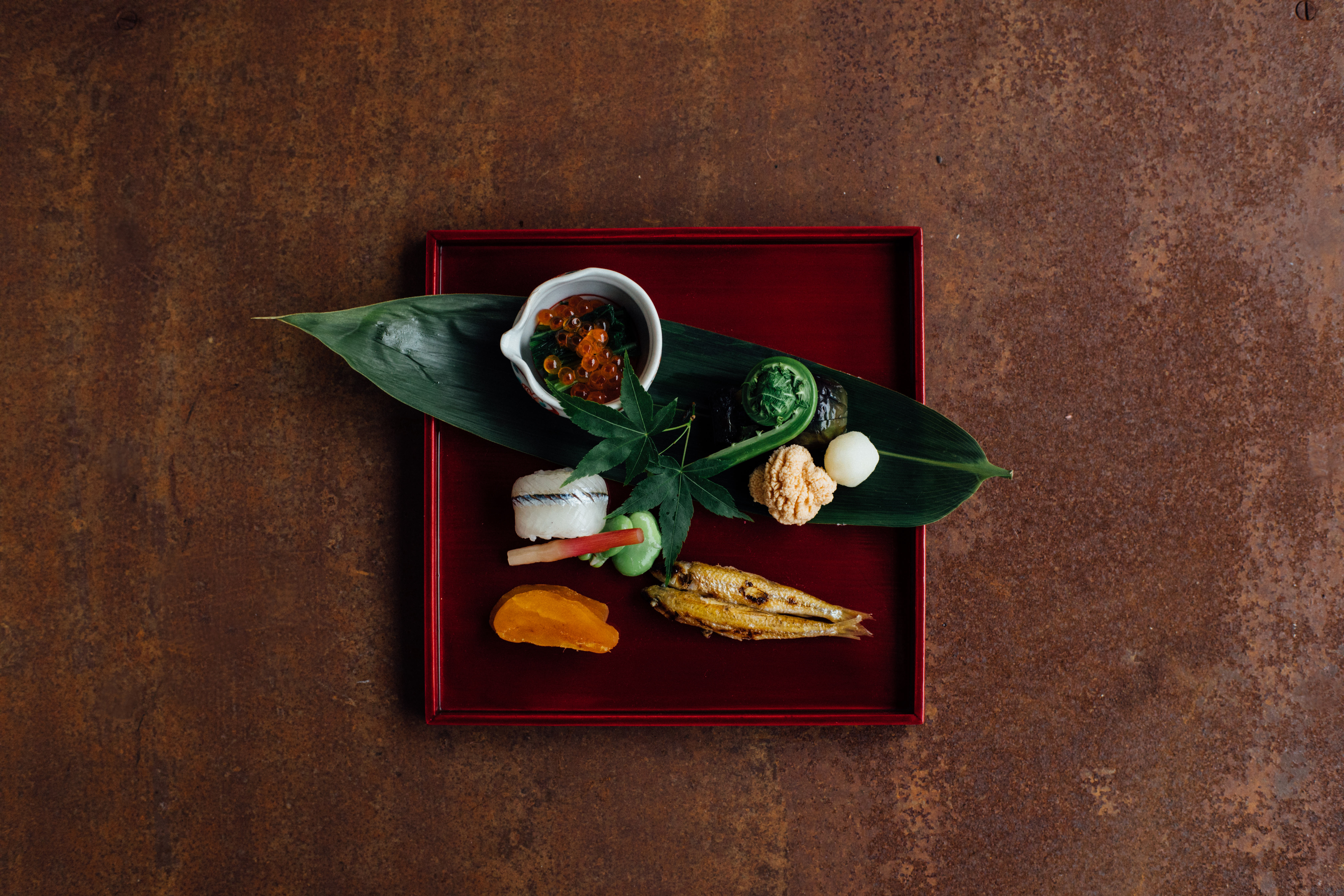
Red lacquer tray with seasonal appetizers on a bamboo leaf, set on rusted steel
PWS Shonan
Arrow pointing right icon
Art Direction & Curation
PWS Shonan lobby: a sculptural shell-form artwork on a stone counter between timber-panelled walls
Ready for the next step?
Let’s bring your project to life
Get in touch
Get in touch
Blurred interior with framed pictures and figures in warm orange light