
.jpg)
5-1 Koishikawa
Bunkyo, Tokyo
Japan


Most product UI drifts as it grows: themes multiply, breakpoints get patched per screen, and a "system" becomes a loose kit that no longer guarantees consistency. TOURS needed the opposite — a component language rigorous enough that consistency across themes and screen sizes is structural, not something a designer re-checks by hand every release. And it had to stay human: a recruiting product whose profiles feel warm, not like a database.
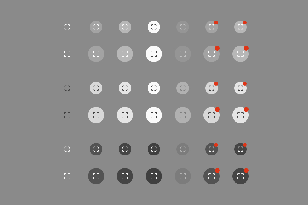
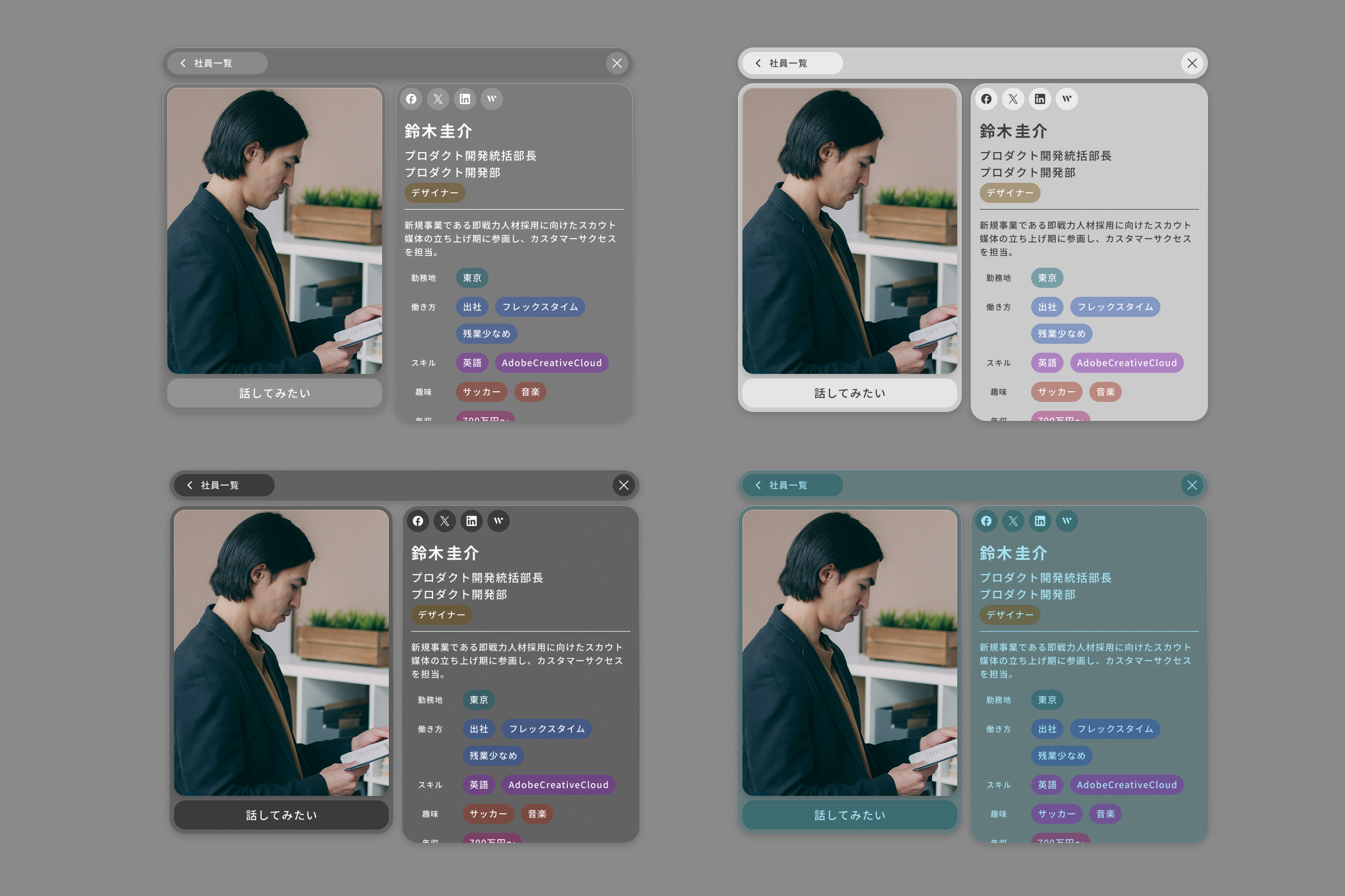
I decided consistency shouldn't depend on discipline at build time — it should be designed into the components, so good screens become the default output rather than a thing you police. So I encoded responsiveness and theming at the component level: the system decides how a profile reflows and re-themes, and the screens simply inherit it. Architecting the system that makes good screens inevitable is the work; the screens are its evidence.
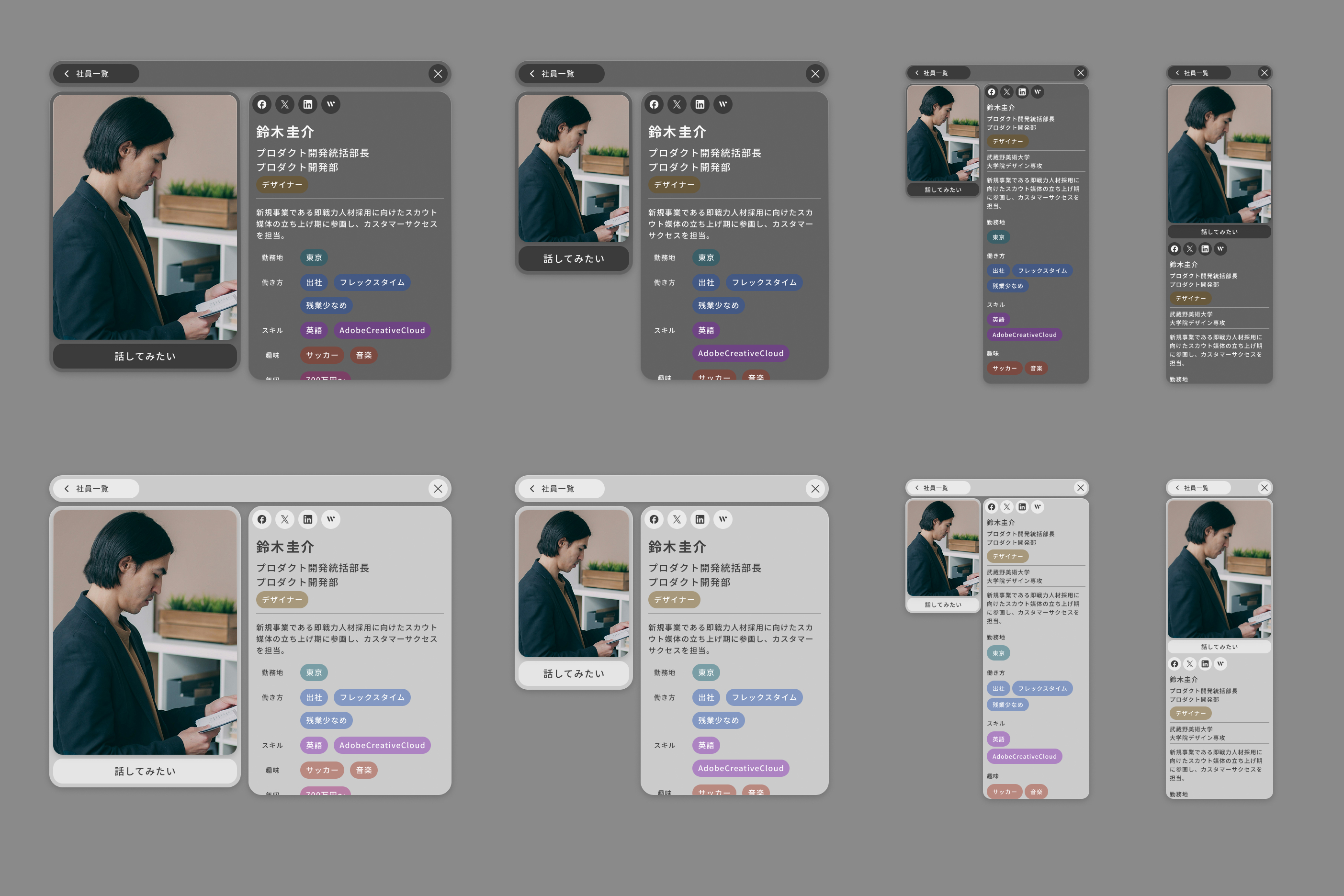
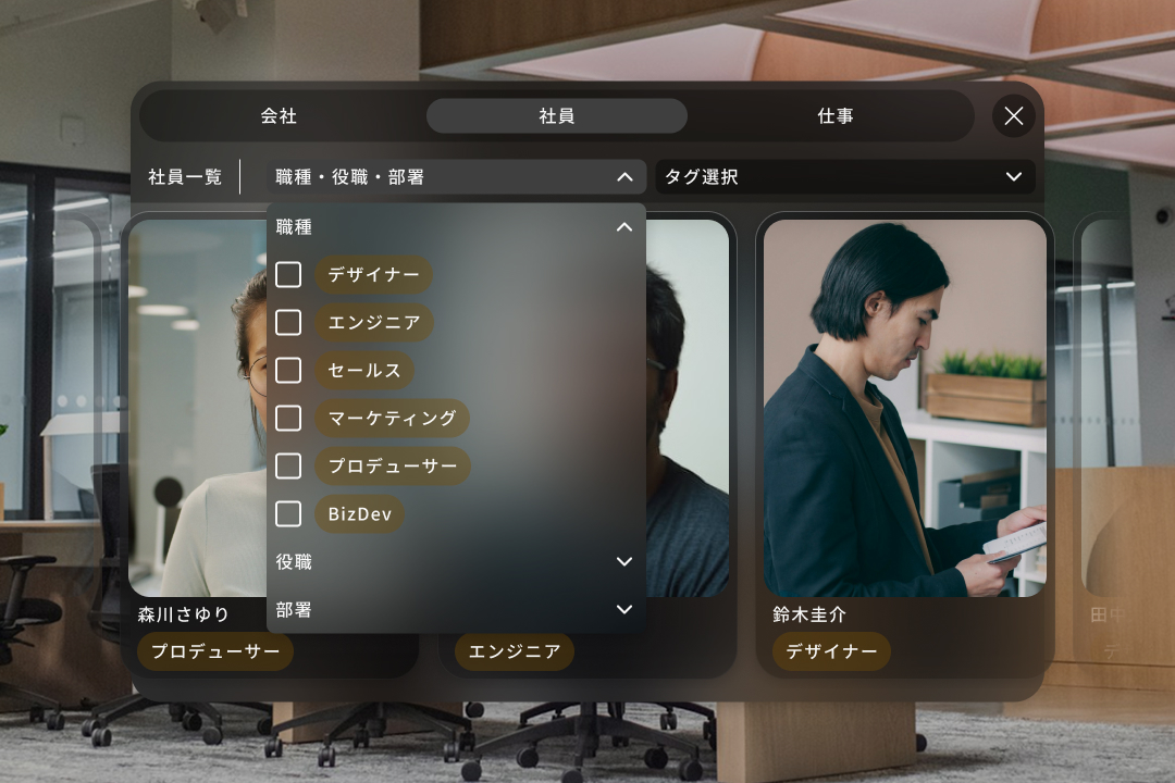
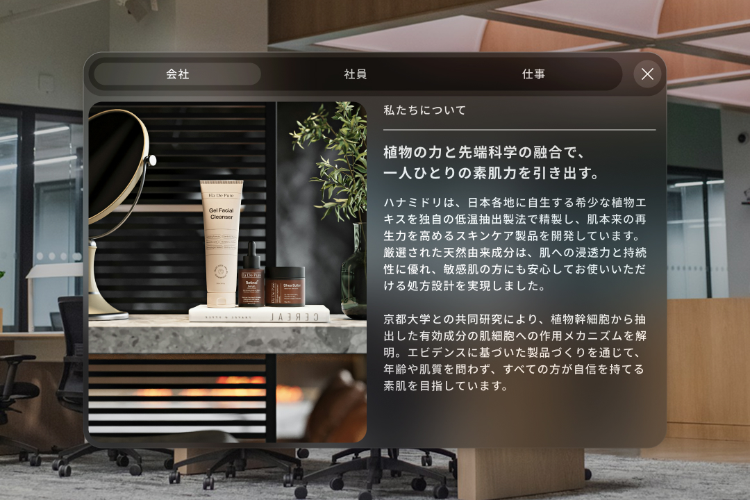
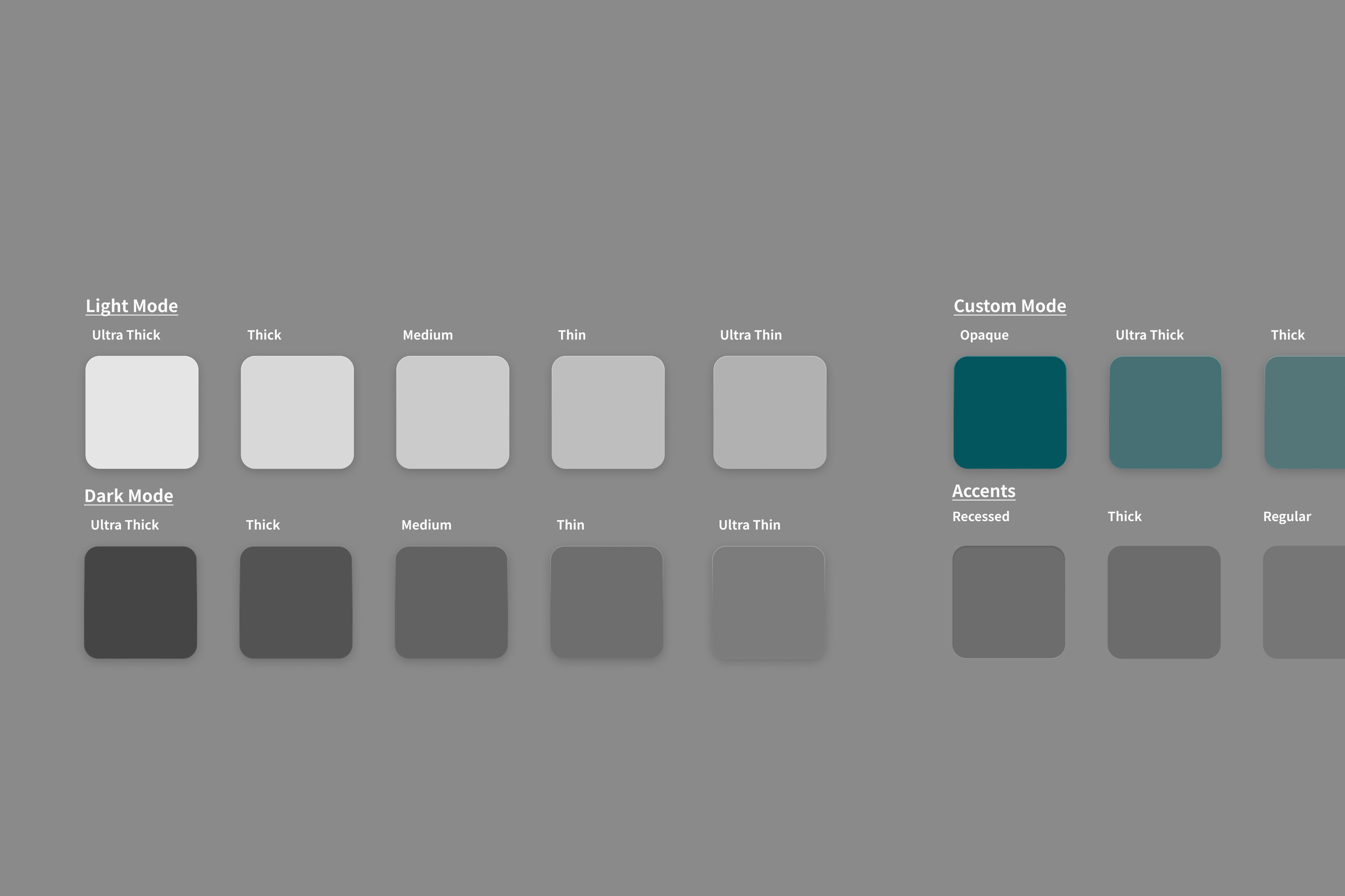
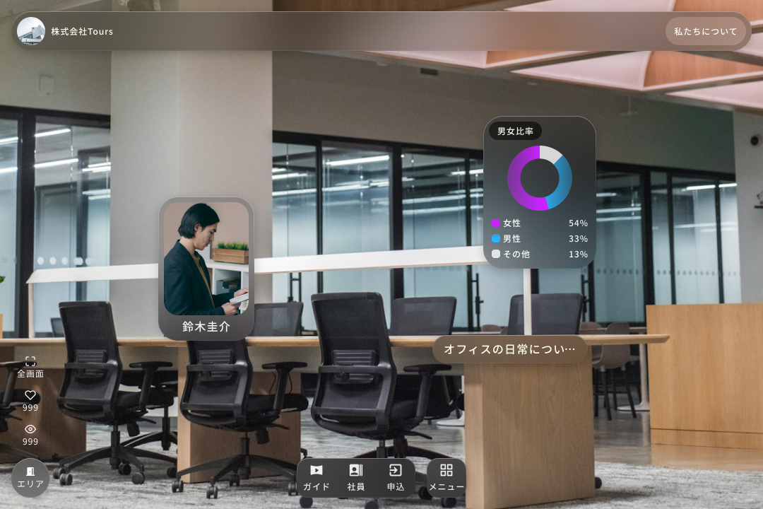
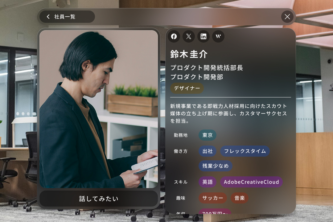
The system carries four coordinated theme modes — glass, light, dark, and custom colour — a real glassmorphism signature, not a default kit. Responsiveness is documented like engineering: a breakpoint grid (width 400 / 688 / 872 / ∞, height 240 / 400 / 700 / ∞) across which the profile card reflows its content rather than merely resizing. On top of that sit the applied screens — the People Profile modal with skill/condition tag chips, a daily-schedule timeline, interview Q&A, and a "話してみたい" CTA — production-ready and human because the system underneath them is coherent.