
SOJYU

A wellness brand built whole — strategy, scent, product, space, and the site that sells it.

Brand Strategy
Art Direction
Product Design
UI/UX Design
Web Design
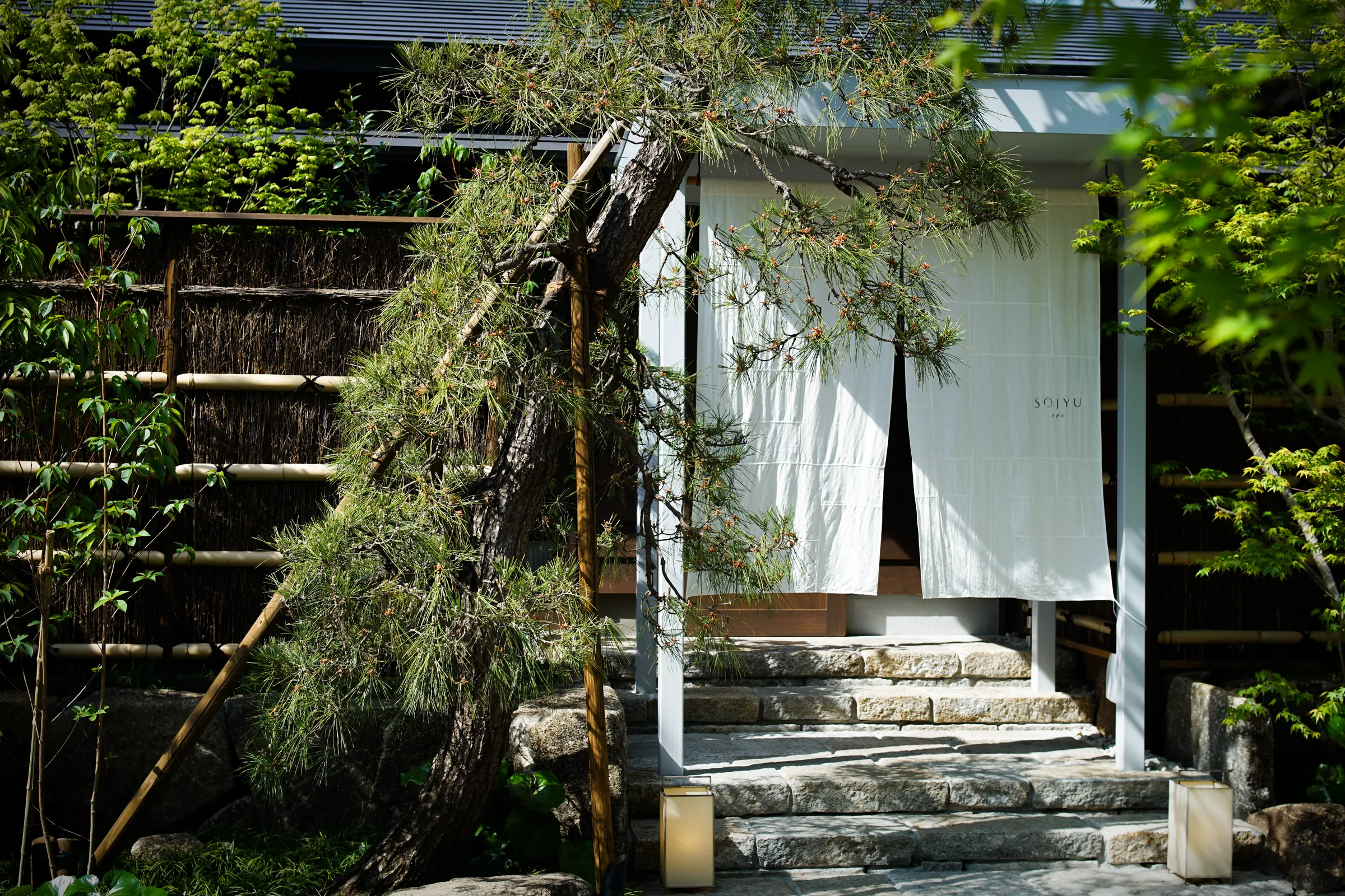
SOJYU store entrance: white noren curtains under a pergola, stone steps and garden greenery
Role
Brand creation, end-to-end (in-house at UDS)
Year
2023–2024
Location
Tokyo
SOJYU is a personal-care and wellness brand I built from zero, in-house at UDS — a whole system, not a logo. From a blank page it ran through positioning and naming, an original five-scent range, product and packaging, the spa, the photography, and the brand's own bilingual e-commerce site.
No items found.
Context

UDS needed to launch a wellness brand from nothing into a crowded category — one where products look calm but feel assembled: a nice logo on one side, an unrelated interior on the other, a web shop that throws it all away. The task wasn't to decorate an idea but to originate one strong enough to hold across every surface a customer touches — shelf, room, scent, and screen — and refined enough to carry a premium price.
‍

No items found.
Approach

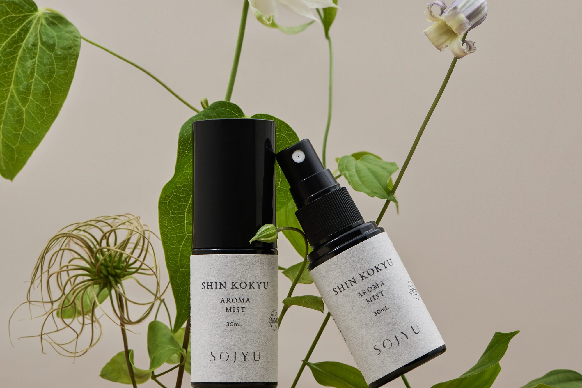
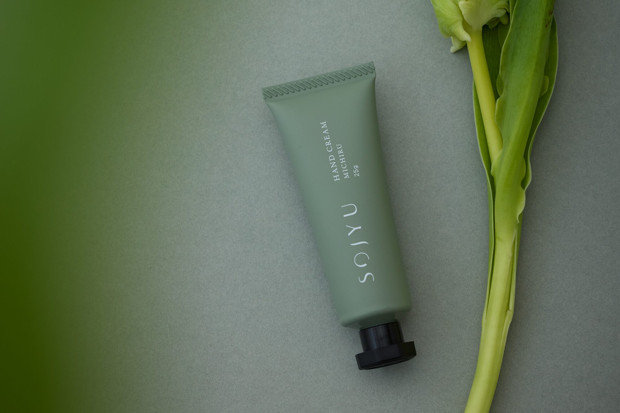
I decided the brand could not be assembled from parts, only originated from one idea — so before any logo or bottle, I fixed a single intention: 素 / 充, the bare self and its fulfilment. Every later choice became a test of one question — does this carry 素/充, or dilute it? That made scent, package, room, and screen answerable to the same standard, not to five separate tastes.
‍

No items found.
Outcome

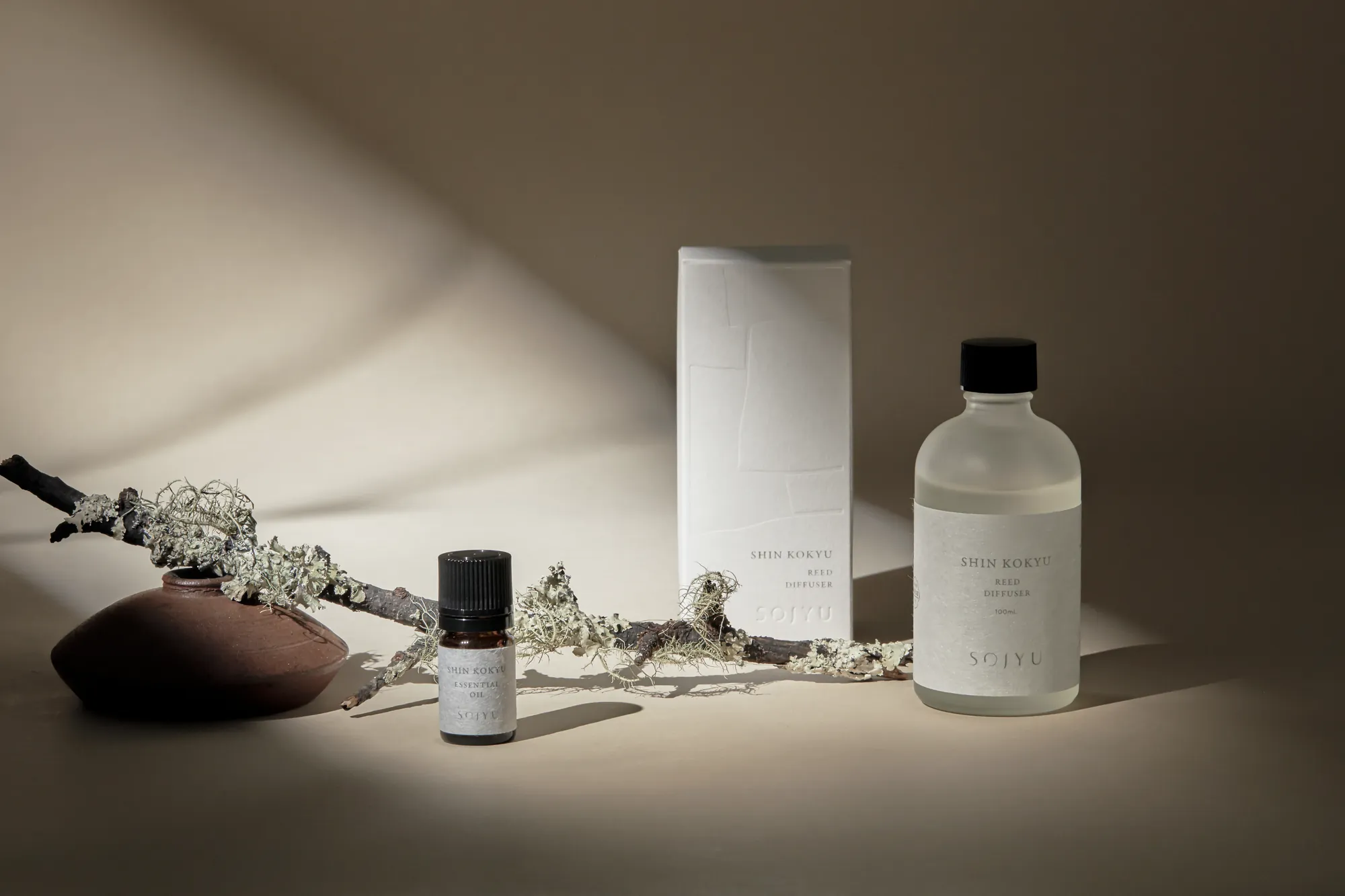
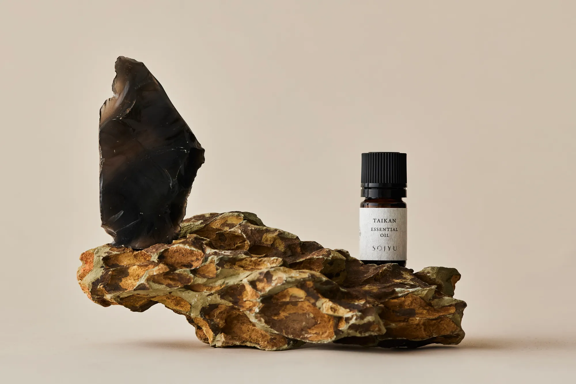
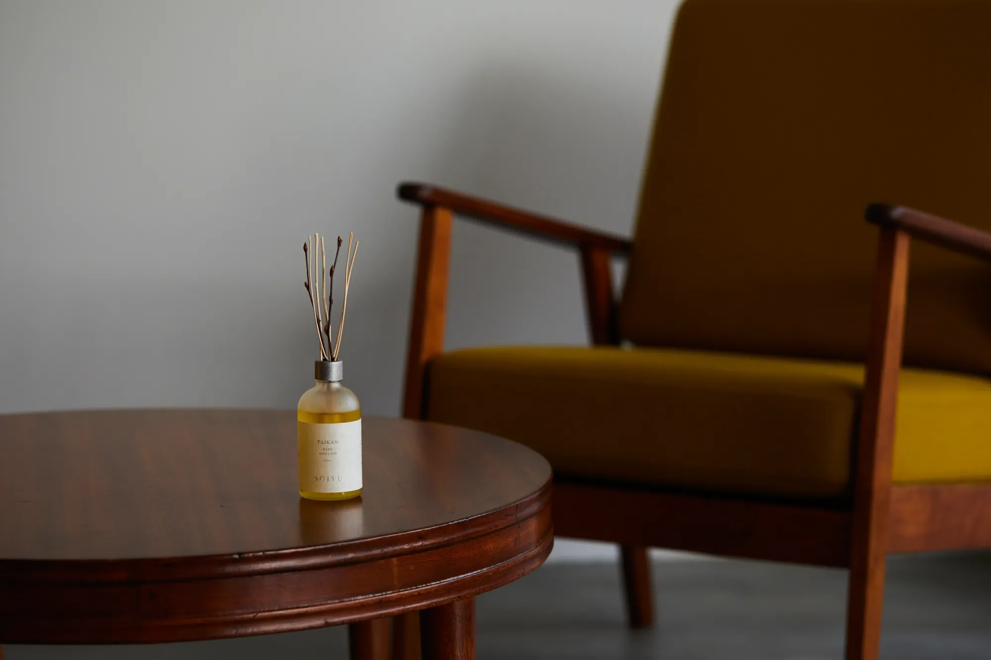
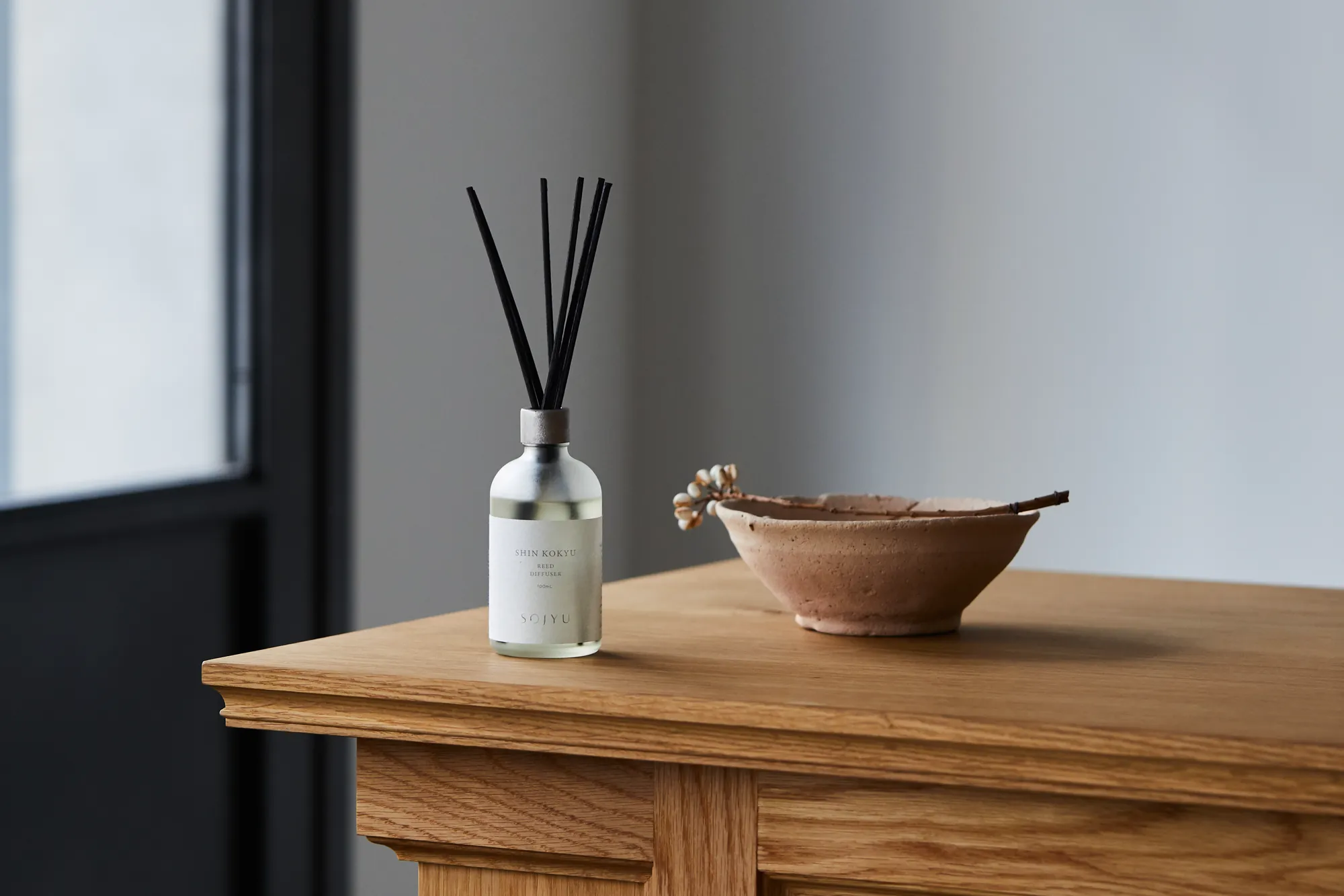
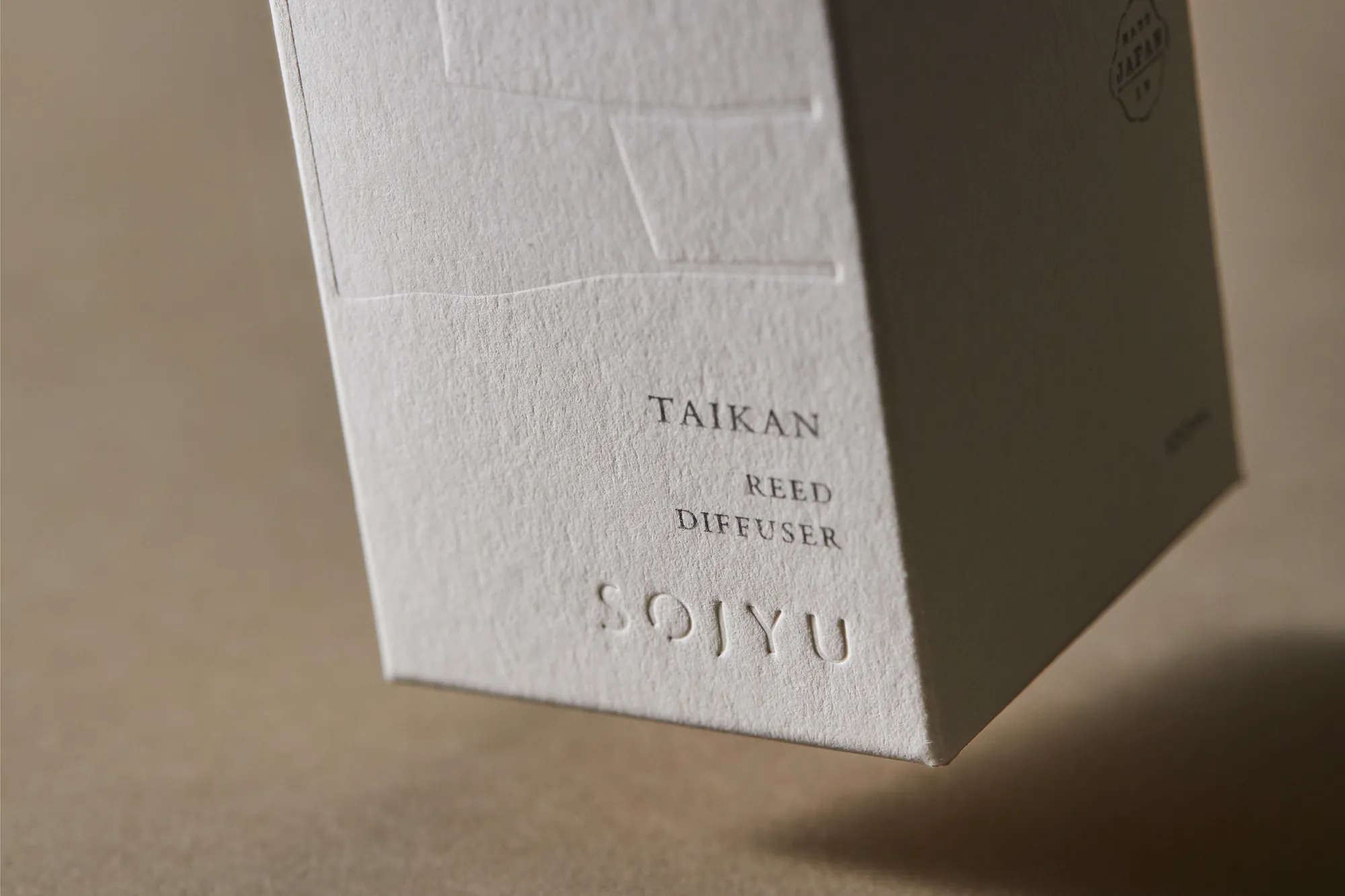
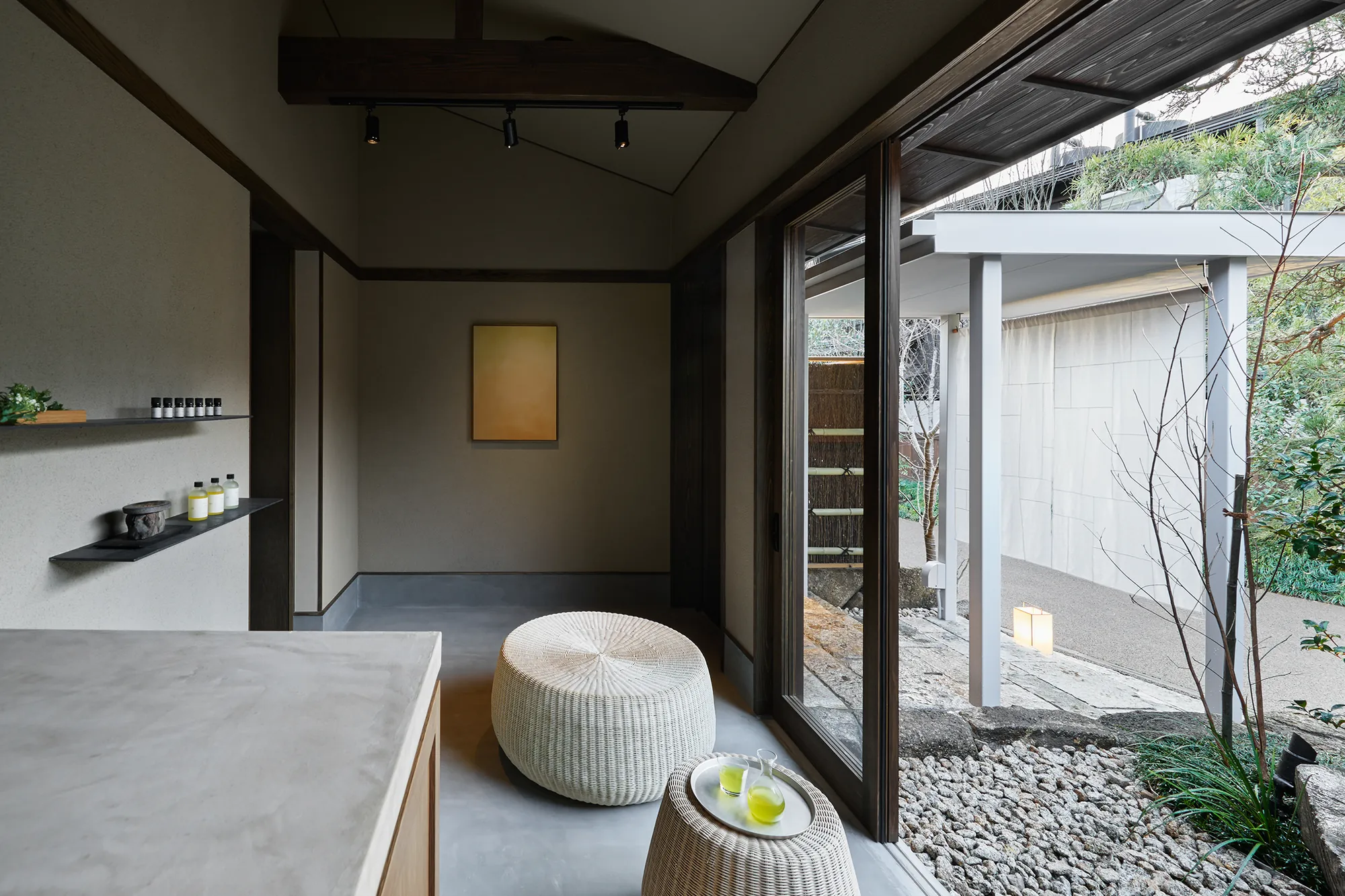
I built the brand from the ground up — first the idea (positioning, name, and the core philosophy of 素 / 充, the bare self and its fulfilment), then carried it without drift into every layer: a five-scent original aroma series with perfumer IZUMI KAN (Taikan, Michiru, Shin Kokyu, Hanayagi, Sosei); packaging and a sustainable-package system; product photography art-directed to a magazine standard; the spa's atmosphere and façade. Then I closed the loop myself — designing and building sojyu.life, a bilingual JP/EN store where kinetic Japanese type and quiet imagery turn the brand's stillness into an interface, and into sales.
‍

‍

No items found.
Credits
Additional work
strangers
Arrow pointing right icon
Exhibition & Object
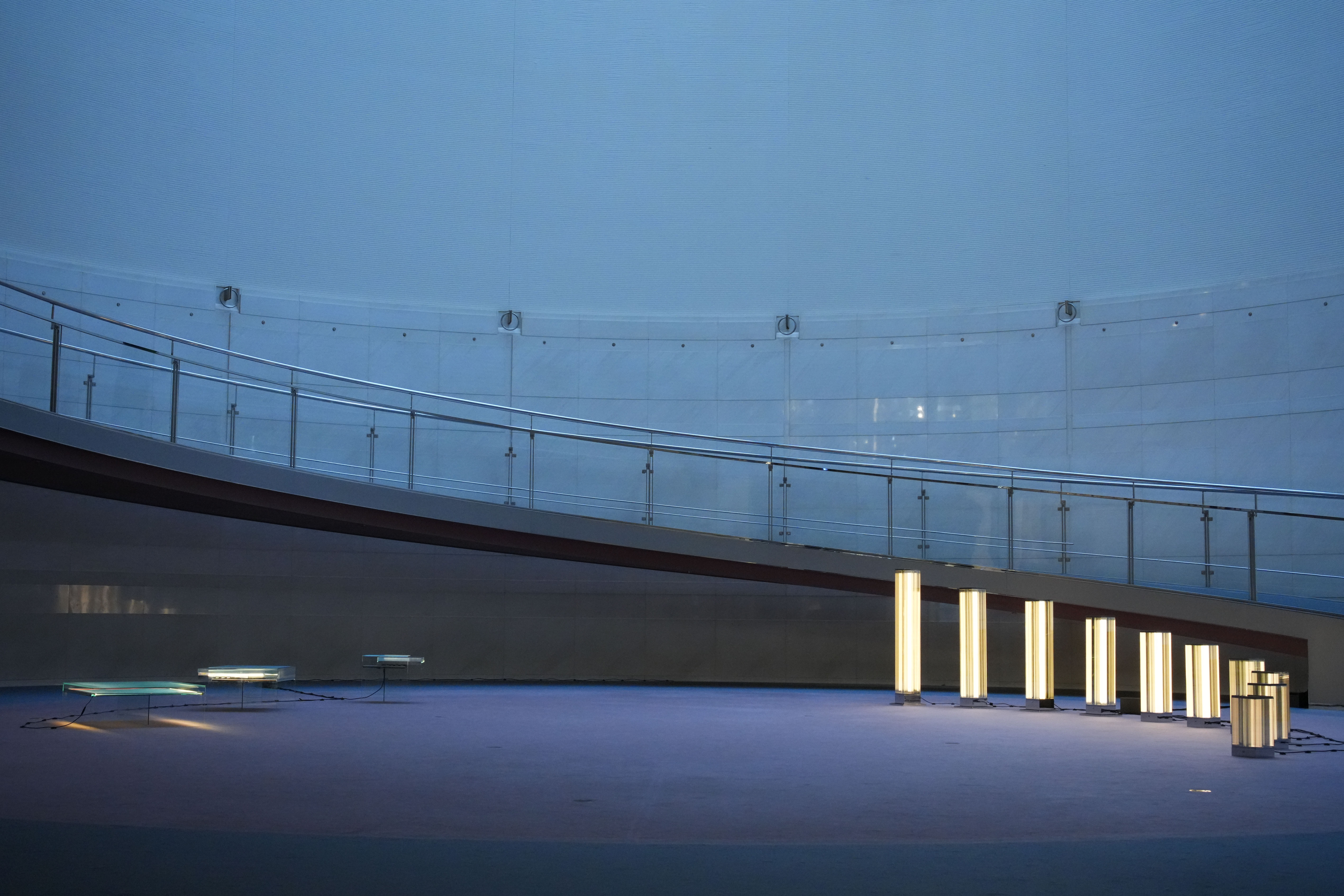
Row of glowing glass light columns on the curved terrace of Spiral, Omotesando, at dusk
TAP
Arrow pointing right icon
Brand Identity
Talent Acquisition Partners logo on a glass office partition, with people meeting behind it
Tours
Arrow pointing right icon
Digital & Systems
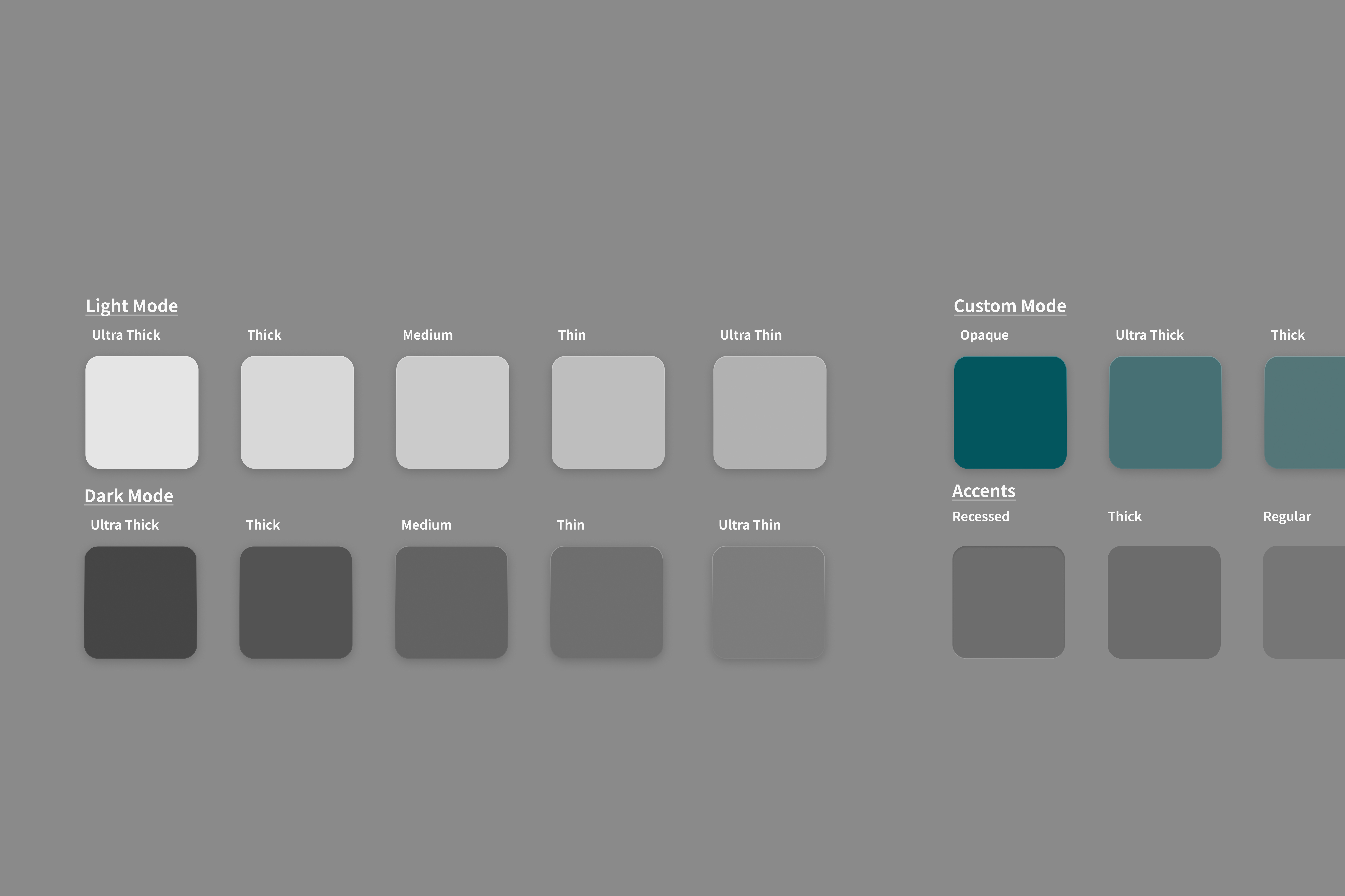
Tours design-system surface tokens: light, dark, custom teal and accent swatches
A live real-estate SaaS
Arrow pointing right icon
Digital & Systems
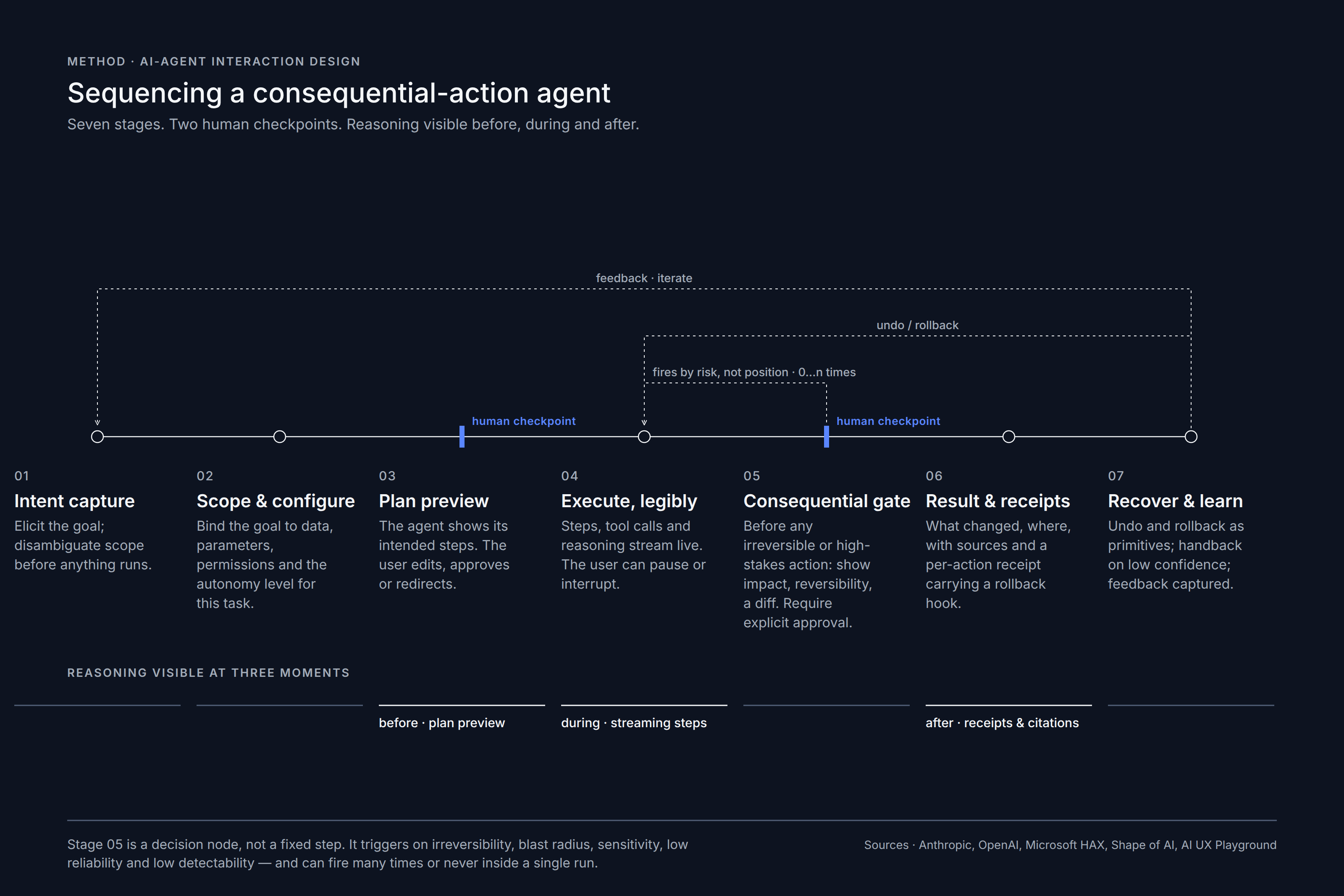
Diagram: sequencing a consequential-action AI agent in seven stages with two human checkpoints
Bricole
Arrow pointing right icon
Spatial & Hospitality
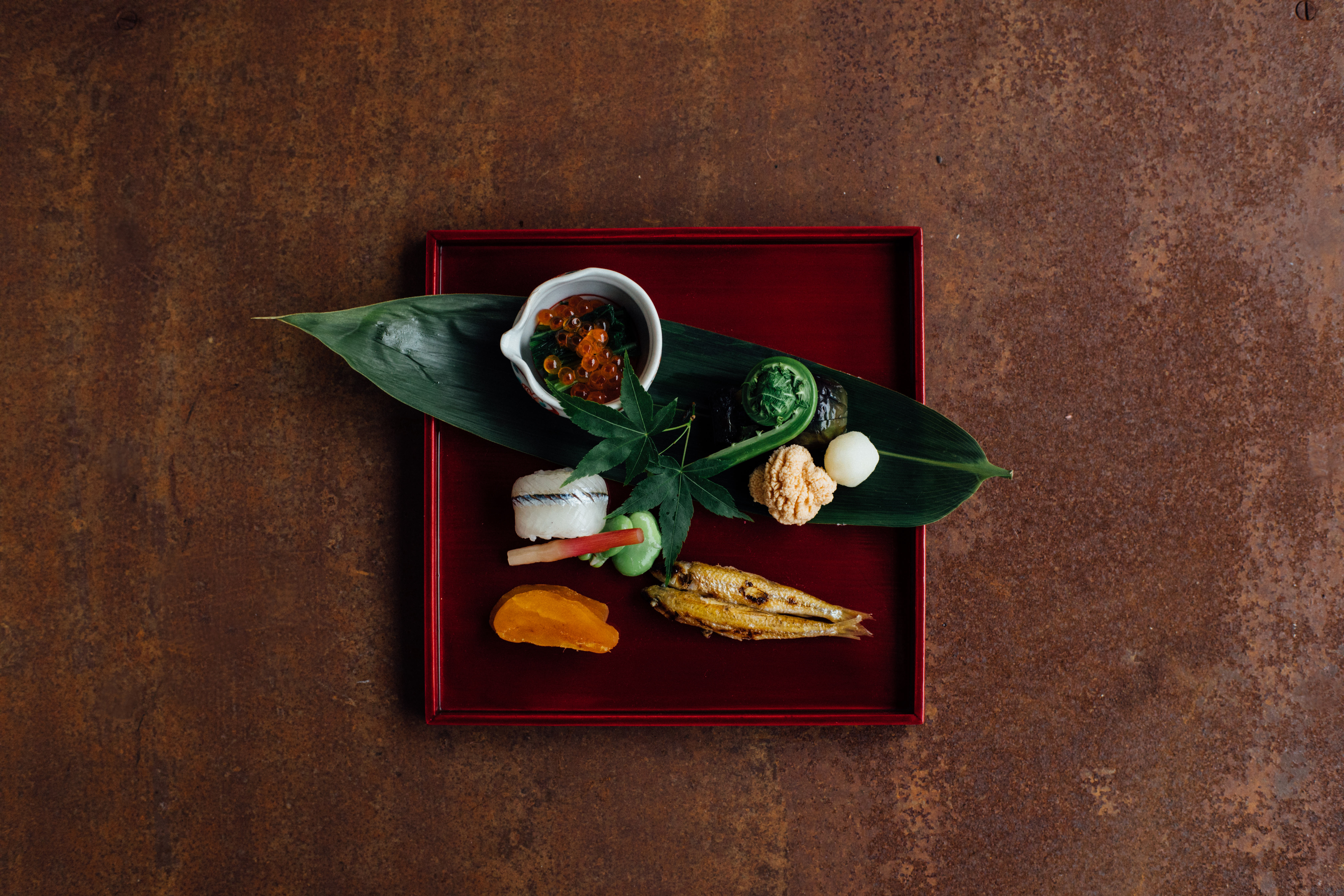
Red lacquer tray with seasonal appetizers on a bamboo leaf, set on rusted steel
Bistro Palette
Arrow pointing right icon
Brand Identity
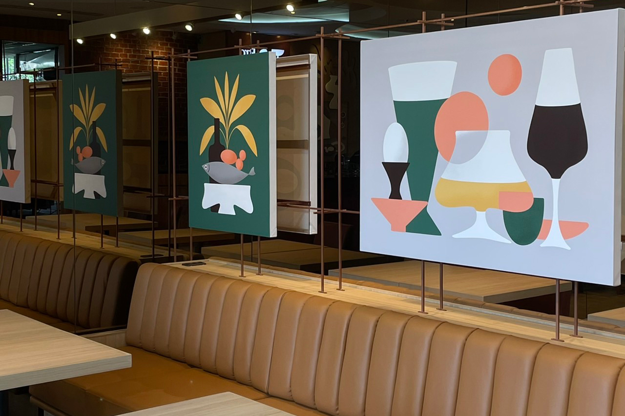
Bistro Palette dining room with tan leather banquettes and bold illustrated panels of Thai dishes
PWS Shonan
Arrow pointing right icon
Art Direction & Curation
PWS Shonan lobby: a sculptural shell-form artwork on a stone counter between timber-panelled walls
Ready for the next step?
Let’s bring your project to life
Get in touch
Get in touch
Blurred interior with framed pictures and figures in warm orange light